When you think of “Firefox,” you probably think of something that looks like this:

Or, perhaps, something like this:

That logo (or some iteration between the two) has been the browser’s logo since it launched back in 2002. Its time for change, Mozilla says.
In a blog post about “evolving the Firefox brand,” Mozilla Creative Director Tim Murray outlines the company’s thinking: Firefox isn’t just one browser now. With side projects like Firefox Rocket (the company’s browser for connections with less bandwidth) and Firefox Reality (Firefox, but for virtual reality), the company is finding it needs a bit more wiggle room with its design language.
While they shared a few work-in-progress potential logos, they were quick to note that none of them are final. They might tweak things over time (and they’re asking for feedback), or just go back to the drawing board all together.
The whole thing might sound a bit up-in-the-air right now, and that’s mostly intentional — it’s still pretty early days in the process. But eventually, Firefox will be getting a new logo; or, more accurately, new logos.
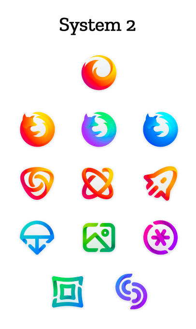
The work was presented in two potential “systems,” each composed of one “Masterbrand” logo and 11 auxiliary logos. The masterbrand would be the primary one used for representing the brand as a whole, while those beneath it could each represent an individual product.
The two new “Systems” of icons:


If it’s a choice between the two systems, I like System 2 — but I’ve always liked the existing Firefox logo, and that’s the set that feels like more of an update and less of a complete replacement. It’s more “Firefox”, less just “fox.”
Firefox says the branding shift should come together “over the next few months” — so if you’re a fan of the classic logo, it’ll still be hanging around for a while.
from TechCrunch https://ift.tt/2LMthOz
No comments:
Post a Comment